thoughts. images. illustration. graphic design.

the blog companion of hopscotch graphics

5.16.2011

. . .blowing in the wind


a whimsical little drawing I did on Sunday, and painted in today. There's just something about coffee isn't there. I'm getting smarter and did the original quite large at about 20" by 18" or so. Now I'll have options as I crop it into the different sizes19x13, 8x10, and 4x6 for my upcoming etsy shop.

5.05.2011

What's up?

A few days of sunshine, and we are all thinking about our gardens, right? Oh so hard to be patient in life. This was an ink-on-tracing-paper drawing, live traced in illustrator and colored with the trusty blob brush.

and then there was . . .


Davis & Graves. I came up with a logo, and then incorporated it into business cards, letterhead, envelopes, web assets, and here -- two of four signs that I designed.  The wave - starting at the lower left - represents the clients that come looking for assistance, and then progressing to the upper right -- move in a positive focused direction, up and onward toward their personal goals.
Great guys, know their stuff, look them up!

5.03.2011

Buzzin'

When we were in Greece, there were the biggest bumble bees. They weren't intimidating because they were just so task oriented, and bumbled their potted plants exclusively.
This guy is fat and looking for work. He's a photoshop colored pen and ink drawing, each section with it's separate mask, and an outline mask to brush up the line work.

5.02.2011

stretching the sketching
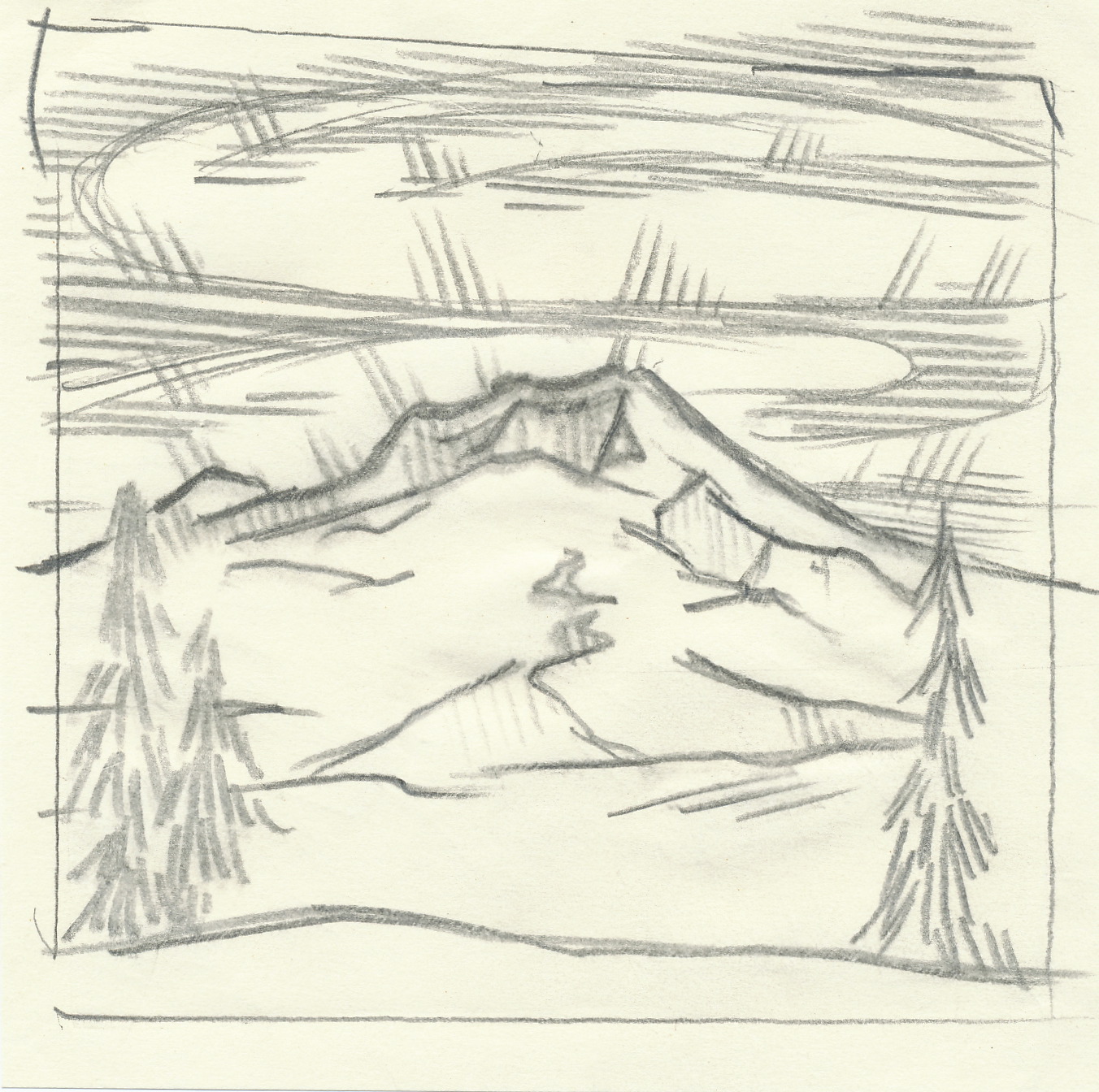
So, I took a pencil sketch and scanned it, opened it in Photoshop, erased the border, adjusted it with levels, and then choose a background and outline color with adjustment gradients. Then just played with textures and colors, and a sketch gets a facelift!

inspired, spires

An original pen and ink on plastic film I scanned and then colored in photoshop. I added the sky and river details I drew at the beach last week - just for fun.

5.01.2011

heavy lifting

T-shirt, poster etc. design for Mt Hood Athletic Club. It started out as a "weightlifting" comp, then "power lifting", and finally "benchpress". But it all goes to help support the Sandy Community Action Center, and that's a great and worthy cause.
Designed in Illustrator.

4.29.2011

spring trilliums


It's Trillium time on the mountain, that means spring is here! This one is a drawing from a photo that I took last week at Wildwood Park. Colored in Photoshop using all the different layers of masked flower pieces. --and no Trilliums are not that yellow, but it won't print so brightly when I get around to actually printing it, but here it is rather brilliant, I hope it's enjoying itself!

4.25.2011

Seeking to be well adjusted


Isolating the pencil drawing using threshold in adjustments, then choosing a fill with a gradient enabled me to play around with colors more before committing myself. It was actually more efficient than opening the original jpg in camera raw as I took the original illustration into photoshop.
I have always just loved cats, and kittens are great, but nothing beats a sweet old cat - sigh.

4.22.2011

the waking of sleeping cats

Sleeping cats can be awakened by photoshop. Original drawing on tracing paper with pencil, then many layered and textured selections. Rudy, that's the name of this favored cat of all time. This is brighter and yellower than it will appear when printed. I have my monitor 20% reduced as I work on things so what I get when printed is more like what I see as I work. But here on the computer screen it's a little overpowering.

4.17.2011

say cheese

Two photos, he smiles in one, she smiles in the other. Just stack them on different layers in photoshop and erase out the part you don't want, to reveal the one you do want. Why should a nice smile go to waste?

4.16.2011

sometimes you feel like a nut . . . .


. . . sometimes you don't. Colored or uncolored versions of a tree that was originally drawn to be scary. Adding leaves, grass and color I hope has made it into a springtime tree awaiting growth.